How to See Flow in Your Data
Holger Schimanski’s new Spotfire Mod makes it easy to get in flow with your data.
Like fish in a stream, it can be hard to see how data flows from point A to B. Sankey charts make it easy. Here’s how they work.
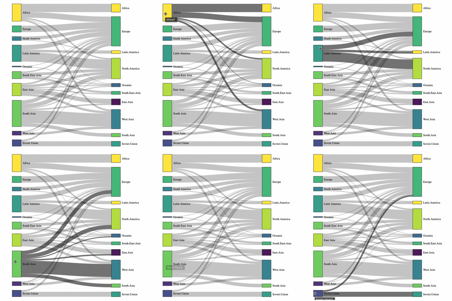
This Sankey chart by data-to-viz shows the migration of people from country A to country B. At a glance, we see that Latin Americans go mostly to North America and Europe; South Asians mostly go to West Asia; Russians stay in Russia ;)
Sankey by Data to Viz. Data from International Migration Review
A new Spotfire Sankey Mod from Holger Schimanski at Bayer makes it easy to attach Sankeys to your data. Here are two examples to get your creativity “flowing.”
The Sankey below shows the flow of electoral college votes in the last three presidential elections: Obama won handily in 2012. After that, votes flowed to Donald Trump—the Sankey looks like a window shade. In 2020, Biden pulled the shade back for the democrats.
This one shows who’s buying your products. On the left, we have product categories; on the right, we see where they went: for example, lots of commercial products flow to the eastern and western regions.
Click on the western region to go deeper. Notice how the middle “Western” bar expands and country detail appears to the right. That helps us see Nigeria mostly buys mostly public sector products…
What questions do you have that involves flow? Sankeys are a great way to explore them.
Discuss / ask questions about this post on LinkedIn.
Want to learn more?
The Spotfire Mod community continues to grow. Over 20 innovative Mods have been created this year, making data exploration radically easier. Check out my growing collection of posts about them, or visit www.tibco.com/mods to download and try them yourself.
This discussion of Sankey Charts versus the related, but different, Alluvial Chart by Benjamin Peterson an excellent resource.
To download and try the Holger Sankey Mod, visit the Spotfire Community and click “Try” (or for on-premise use, click “download.”)


