Animated Visual Analytics
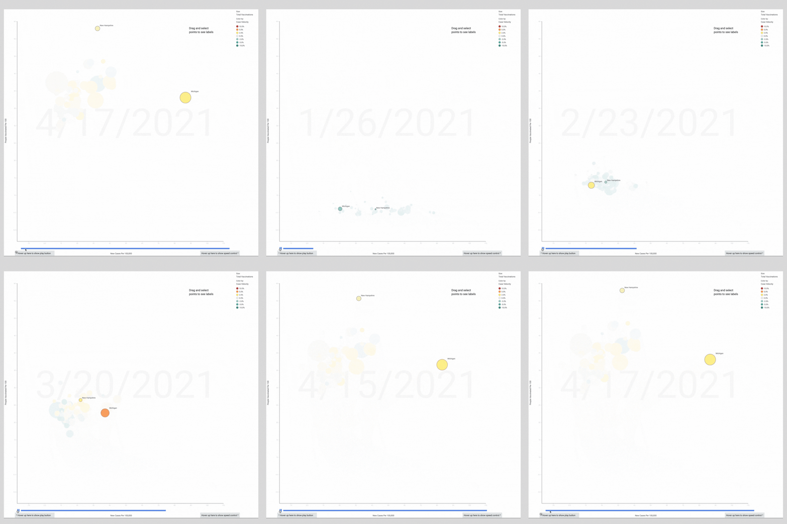
Animation helps artists unfold stories. Adam Faskowitz created this animated visualization that tells the recent COVID vaccination and infection story in the United States. It’s a visualization that might make animators at Pixar proud. It shows:
time (via animation)
state (each bubble represents a state)
number of people vaccinated per 100 (on the Y-axis from 0-60)
new cases per 100,000 people (on the X-axis)
total number of vaccinations by state (the size of each bubble)
the rate of change in the number of reported cases (the color of each bubble: green means cases are decreasing; orange means cases are increasing)
Here’s how it works. Watch Michigan. In January, its bubble is green, which means COVID cases there were decreasing by 2%. In March, Michigan turns yellow. Then orange--cases are increasing. The Michigan bubble lurches right—new cases per 100,000 explode. Today, Michigan leads the nation in cases, not a race you want to win.
Next, watch our hero, New Hampshire. Through March, New Hampshire isn’t unique--they move in unison with the vaccination peloton. Then their bubble shoots up--vaccinations per 100 take off. In the closing scene--the past week--New Hampshire starts to turn green—case velocity is slowing again. Bravo, New Hampshire!
* * *
Great visualizations don’t just give answers. They tell stories and spark questions.
I’ve watched this animation dozens of times—it makes me wonder what happened in Michigan in late February? How did New Hampshire make vaccinations jump in April? How does New York, where I live, compare?
Try it for yourself. Here’s Adam’s animated bubble chart with all 50 states. Press play to watch the story unfold yourself and see what you wonder.
Thank you Adam Faskowitz and the TIBCO team for this visualization and the public service it provides. To explore the full interactive dashboard visit the free TIBCO COVID Response Analytic App here.

